
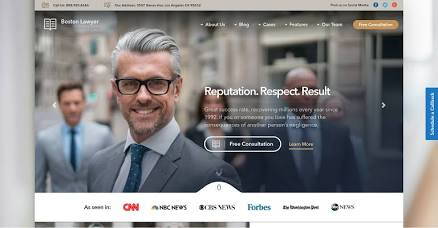
Law firm website examples are only useful if you know what to look for. A gallery of screenshots shows you colors and photography, but it cannot tell you why a site works. What makes a strong site is structure: how it greets a worried visitor, how it proves competence, and how it asks for contact.
This guide skips the screenshot gallery. Instead, it breaks strong law firm website examples into eight repeatable design patterns, flags three patterns that tend to backfire, and gives you a thirty minute method for reviewing any site you admire. We describe patterns rather than naming firms, so you can apply the ideas in your own market without copying anyone.
How to Study Law Firm Website Examples Without Copying Them
Most people browse examples the wrong way. They collect favorites, then ask a designer to make something similar. The result looks familiar and does not fit the firm. Try this approach instead.
- Study patterns, not pixels. Write down what each site does in its first screen, not what colors it uses.
- Look beyond your own city. Review firms in your practice area in other states, so you learn from the idea without imitating a local rival.
- Look outside law. Medical practices, financial planners, and accounting firms also serve worried clients and often handle trust well.
- Ask what problem each element solves. If you cannot name the problem, you probably should not copy the element.
Eight Patterns Worth Copying
- The problem first headline. The opening line names the visitor’s situation, such as a divorce, an arrest, or an injury, instead of announcing the firm. It works because people search with a problem in mind. Keep the wording plain, and avoid promising outcomes.
- The two door homepage. Two clear paths split different audiences, for example individuals and businesses, or people who need help now and people planning ahead. It suits firms with mixed practices. Make sure each door leads to a page written for that audience.
- The process ribbon. A short strip of three to five steps shows what happens after the first call. It lowers fear of the unknown. Keep the steps honest, and avoid timelines you cannot promise.
- The attorney spotlight. A real face, a name, and one human sentence appear near the top of key pages. It works well for solo and small firms where the client is choosing a person. Use a current photo.
- The local proof strip. Bar admissions, court admissions, community roles, and reviews where your state allows them sit in one tidy band. It gives skeptical visitors quick evidence. Check your state rules before listing anything that sounds like a ranking.
- The honest scope block. A short section says what you handle and what you do not. It reduces unqualified calls and builds trust. Keep it simple and link to related help where appropriate.
- The quiet intake. A short form, a phone number, and an optional text or chat route sit together with a plain statement about confidentiality, and no pop ups. It respects a stressed visitor. Do not ask for sensitive case details in the form.
- The answer hub. Real questions are grouped by stage, such as before you hire, during the case, and after the result. It helps visitors self qualify and gives search engines useful content. Write answers from actual client calls.
Three Patterns Worth Skipping
- The wall of badges and superlatives. Rows of logos and words like best or top can invite questions under state advertising rules, and visitors tend to scroll past them. Use fewer, accurate, current credentials instead.
- The autoplay video hero. A background video slows the page, drains phones, and hides the message. A short video that plays only on request is a better choice.
- The gavel and scales stock photo. Generic legal imagery says nothing about your firm. Real photos of your team, your office, and your community make a stronger impression.
Matching Patterns to Practice Areas
Not every pattern fits every firm. Use this as a starting point.
- Family law: problem first headline, quiet intake, and answer hub.
- Criminal defense: problem first headline, process ribbon, and a very visible phone number.
- Personal injury: process ribbon, honest scope block, and local proof strip.
- Estate planning: two door homepage and answer hub.
- Business law: two door homepage and attorney spotlight.
- Immigration: honest scope block and an answer hub that includes the languages you serve.
A Thirty Minute Example Review
Set a timer and review five to eight sites, spending about five minutes on each.
- Capture the promise on the first screen in one sentence.
- Note the main action the site asks for.
- Note how it shows proof and explains the process.
- Write one thing you would copy and one thing you would change.
- When you finish, circle the three patterns that appear most often among the sites you liked.
- Write a one page pattern brief: the three patterns you will adopt, the two you will skip, and the practice areas they apply to.
That brief is far more useful to a designer than a folder of screenshots. If you want help turning it into a finished site, you can see how Elevate Web Designs works with attorneys at https://elevatewebdesigns.com/premium-law-firm-web-design-why-attorneys-nationwide-choose-elevate-web-designs/.
What Examples Cannot Tell You
Examples show design, not results. A site can look excellent and still load slowly, collect few inquiries, or break state advertising rules. You cannot see another firm’s conversion rate, maintenance habits, or compliance review from the outside. Use examples for ideas, then judge your own site by the calls and forms it produces.
Q&A: Common Questions About Law Firm Website Examples
What makes good law firm website examples?
The best ones make the next step obvious. They name the visitor’s problem, show credible proof, explain what happens next, and make contact easy, all while following state advertising rules.
Where can I find good law firm website examples?
Search your practice area together with cities you do not serve, and review the top results across several markets. Portfolio pages from web design studios that work with attorneys are another good source.
Is it okay to copy a competitor’s layout?
Borrow patterns, not wording or images. Copying text or photos can infringe copyright, and repeated content also creates duplicate content problems in search.
How many examples should I review?
Five to eight is enough. After that, you mostly see the same patterns repeated.
Should a law firm website look different for each practice area?
The tone and emphasis can change, for example a calmer approach for family law and a faster, more direct one for criminal defense. The brand, layout, and navigation should stay consistent across the site.
Do award badges help?
Only when they are accurate, current, and allowed under your state’s rules. A few relevant credentials work better than a wall of logos.
Should I use video on my law firm website?
A short, real introduction can help, as long as it loads only when someone presses play. Avoid autoplay.
How do I know whether my site is better than the examples I like?
Compare outcomes, not looks. Track calls and form submissions, and ask new clients what convinced them to reach out.
The Bottom Line
Good law firm website examples teach you patterns, not templates. Study what each element does, adopt the few patterns that fit your practice, skip the ones that backfire, and judge the result by the inquiries it brings in. A one page pattern brief will serve you better than a hundred screenshots.